

Grace Farms by Sanaa
Recently, TeamUP took a quick trip to visit to New Canaan, CT - the area of coastal Connecticut that was once known as the stomping grounds for the “Harvard Five.” Since the architects Marcel Breuer, Phillip Johnson, and their contemporaries first began working in the area, more than 125 modern homes have sprung up. However, there is one structure that stands out from the pack - Grace Farms, by the Japanese architecture firm Sanaa.
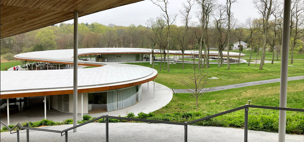
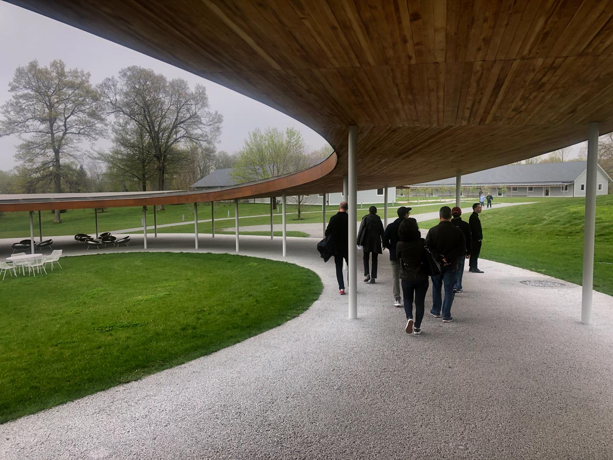
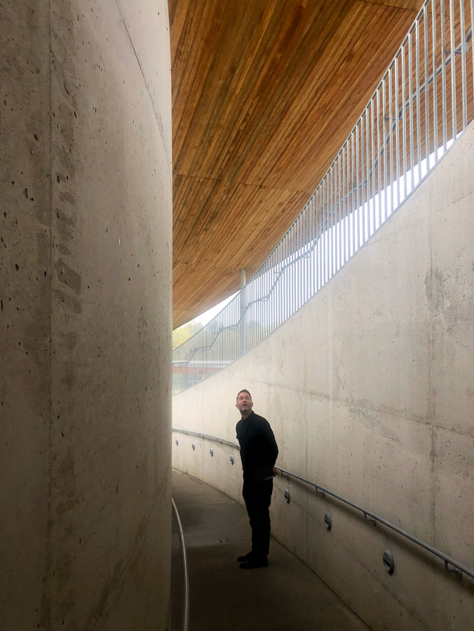
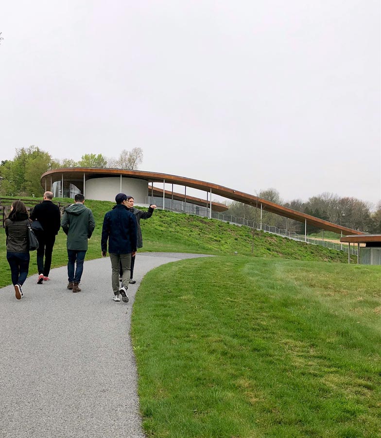
Upon first arrival onto the sloping landscape of Grace Farms, it is immediately striking how perfectly integrated the building is with the existing landscape. It almost feels like the architecture was there first and the landscape was built around it. A stunning example of a phrase that is often spoken in our studio: "It all begins with the site."
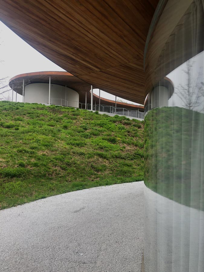
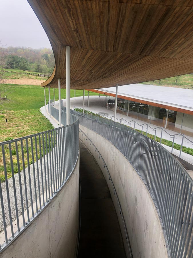
Experiencing the connectivity between building and nature is one of the most prominent aspects of Grace Farms; with its vertical transparency and the solid, horizontal undulating planes all set within a rolling Connecticut landscape. The organic nature of the architectural form juxtaposed within a natural habitat leads visitors to experience the harmony of the 5 distinct programmatic spaces without it feeling misplaced or out of context. Creating a space that is truly relaxing.
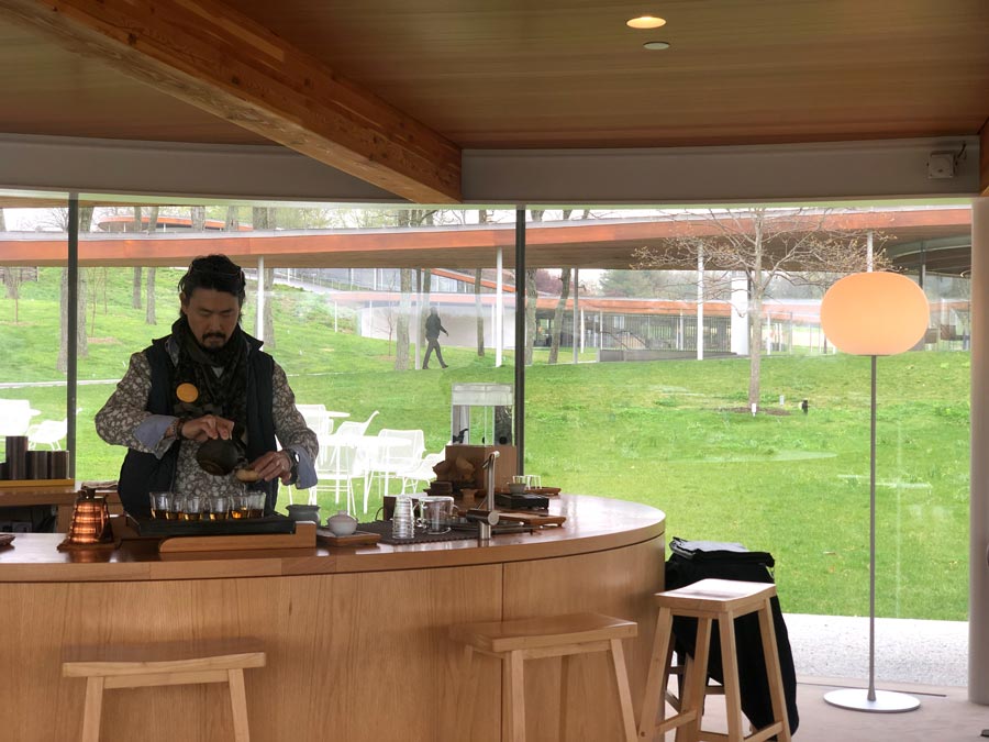
The interior palette consists of natural materials and soft tones that pair beautifully without taking away from the surrounding views though the massive rounded glass walls. This helps the project feel like a seamless integration of an early concept into an impressive final execution.
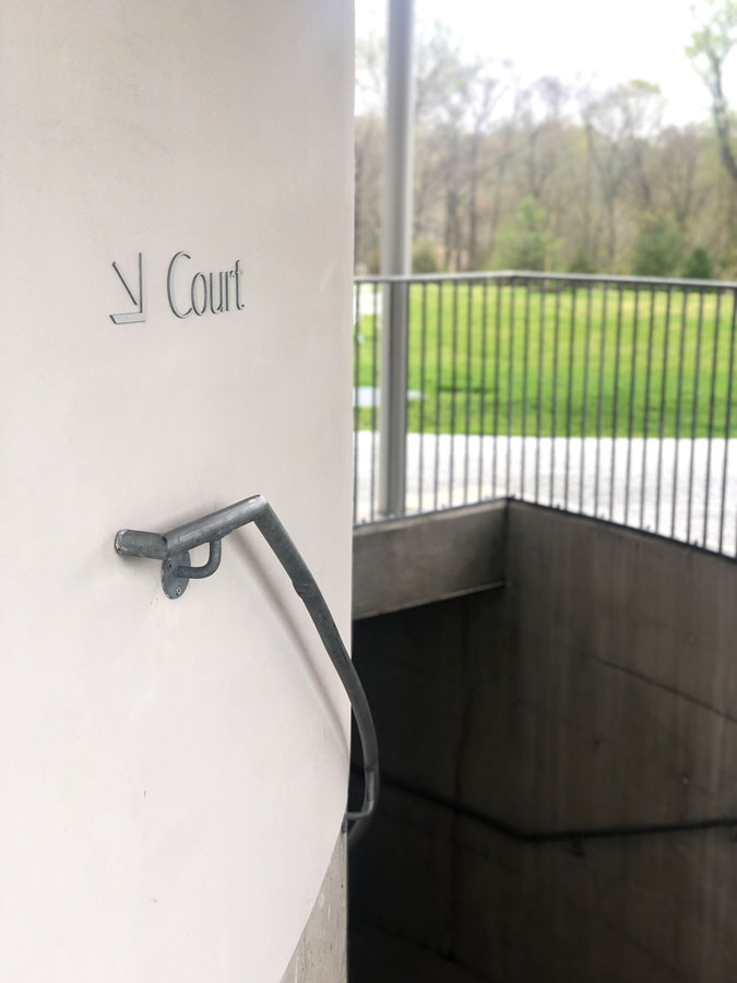
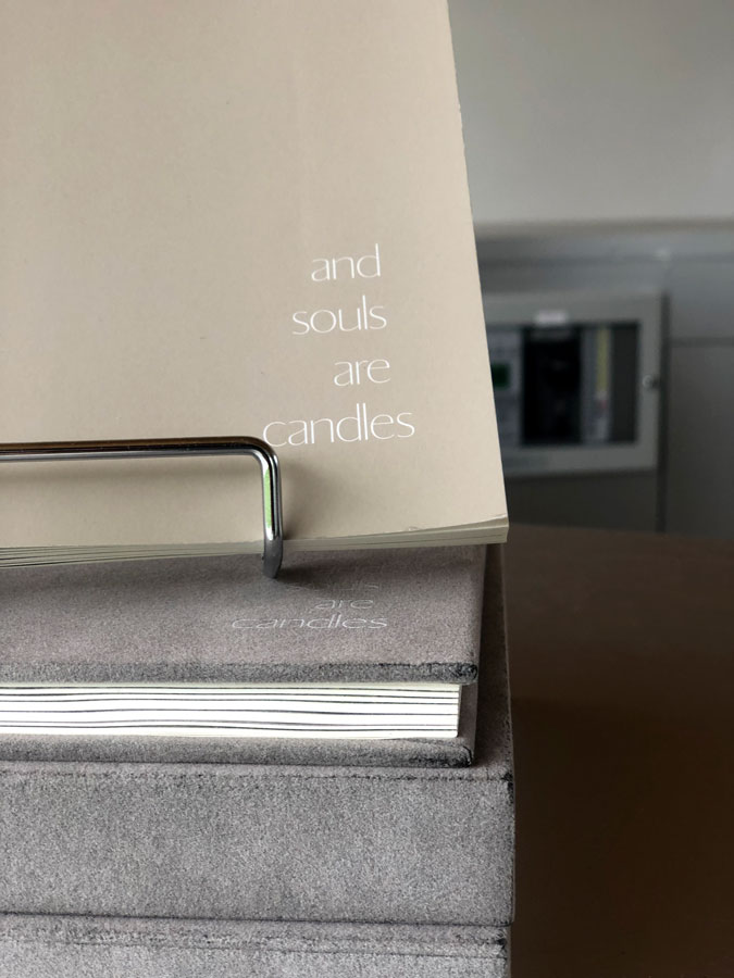
The mission of the organization is quite broad. While it is not a religious organization, it does provide a pavilion that is used by a local church. While it is not a gym, it does provide a pavilion of sport courts for public use. While it is not a library, it does provide a pavilion full of books on art and architecture. And although it may not be a “brand” in itself, it has certainly taken great care to craft a consistent brand design. That visual language relies on a custom typeface and subtle color palette to unify everything from the buildings wayfinding down to their maps and merchandise, all without ever overpowering the surrounding architecture.