

Brighten Core
Originally a quintessential, early 2000s Hamptons traditional home, the structure was weighed down by ornate, "quasi-grand" details that left the interior feeling dark and disconnected. Our goal was a smart modernization that stripped away the excess and focused on how the family actually moves through their home, turning a heavy, traditional house into a bright, flowing, and connected home.
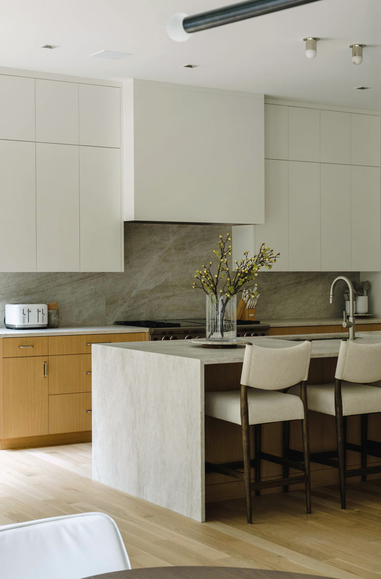
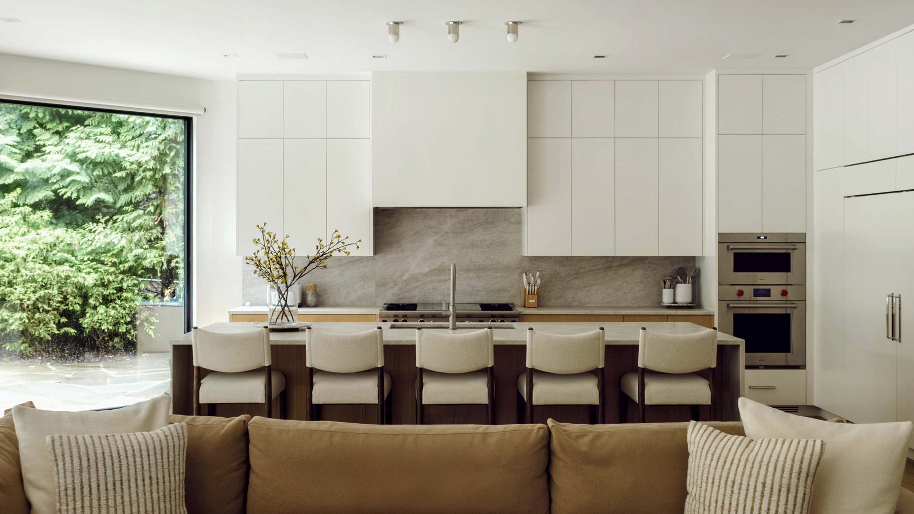
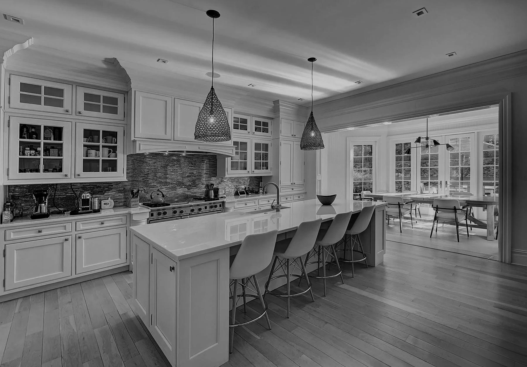
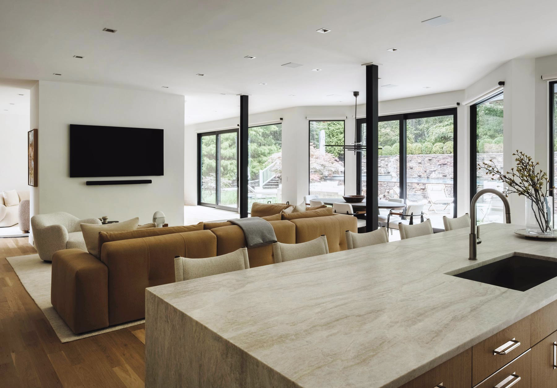
The heart of this renovation was a radical shift to an open plan layout. We identified a major barrier: the original kitchen was stuck in the center of the house, acting as a functional and visual block. By relocating and anchoring the kitchen to a perimeter wall, we instantly allowed the floor plan to breathe.
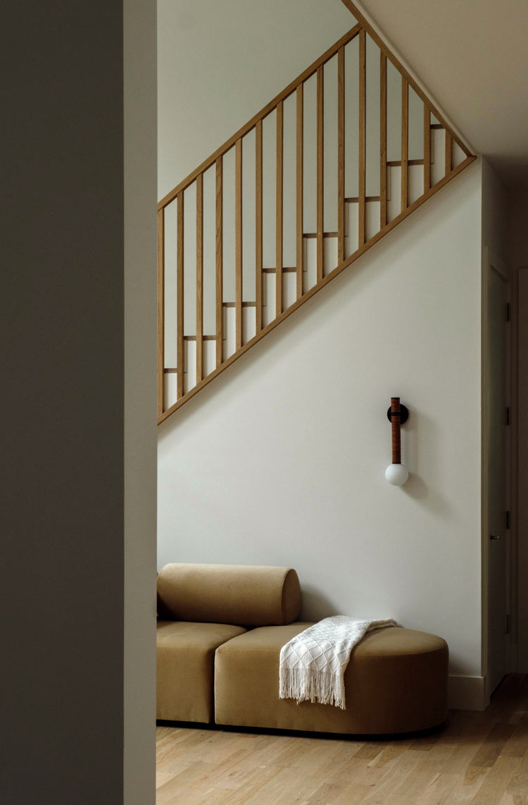
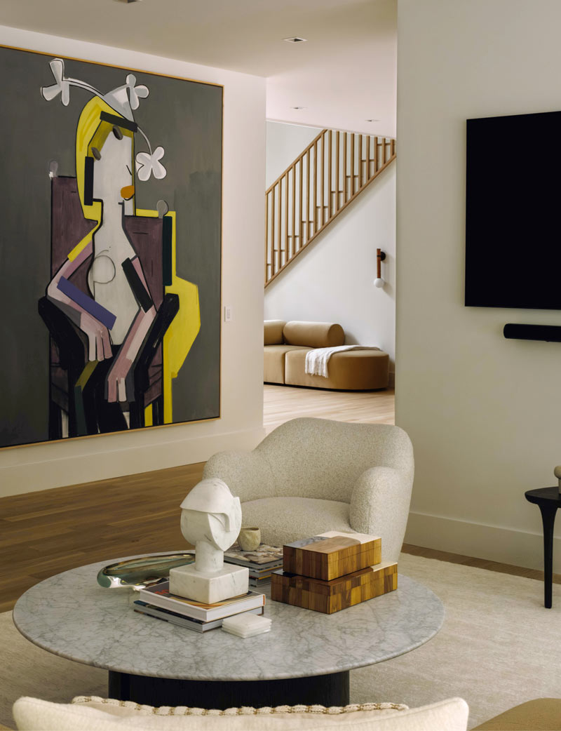
This move opened up a clear sightline from the moment you step through the entryway, where we reconfigured the stair to streamline the flow of the home and bring a sense of calm to the daily transition between floors.
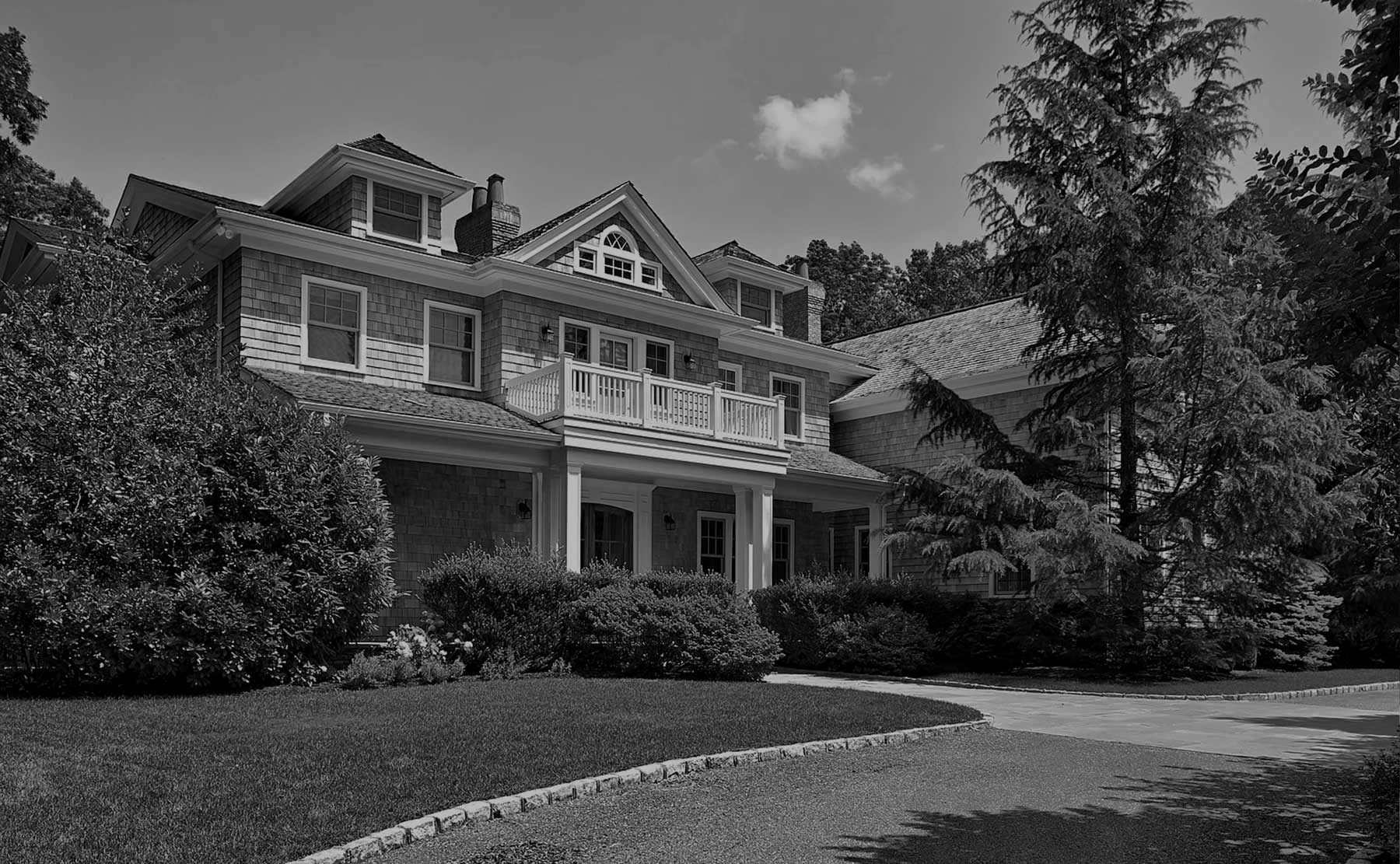
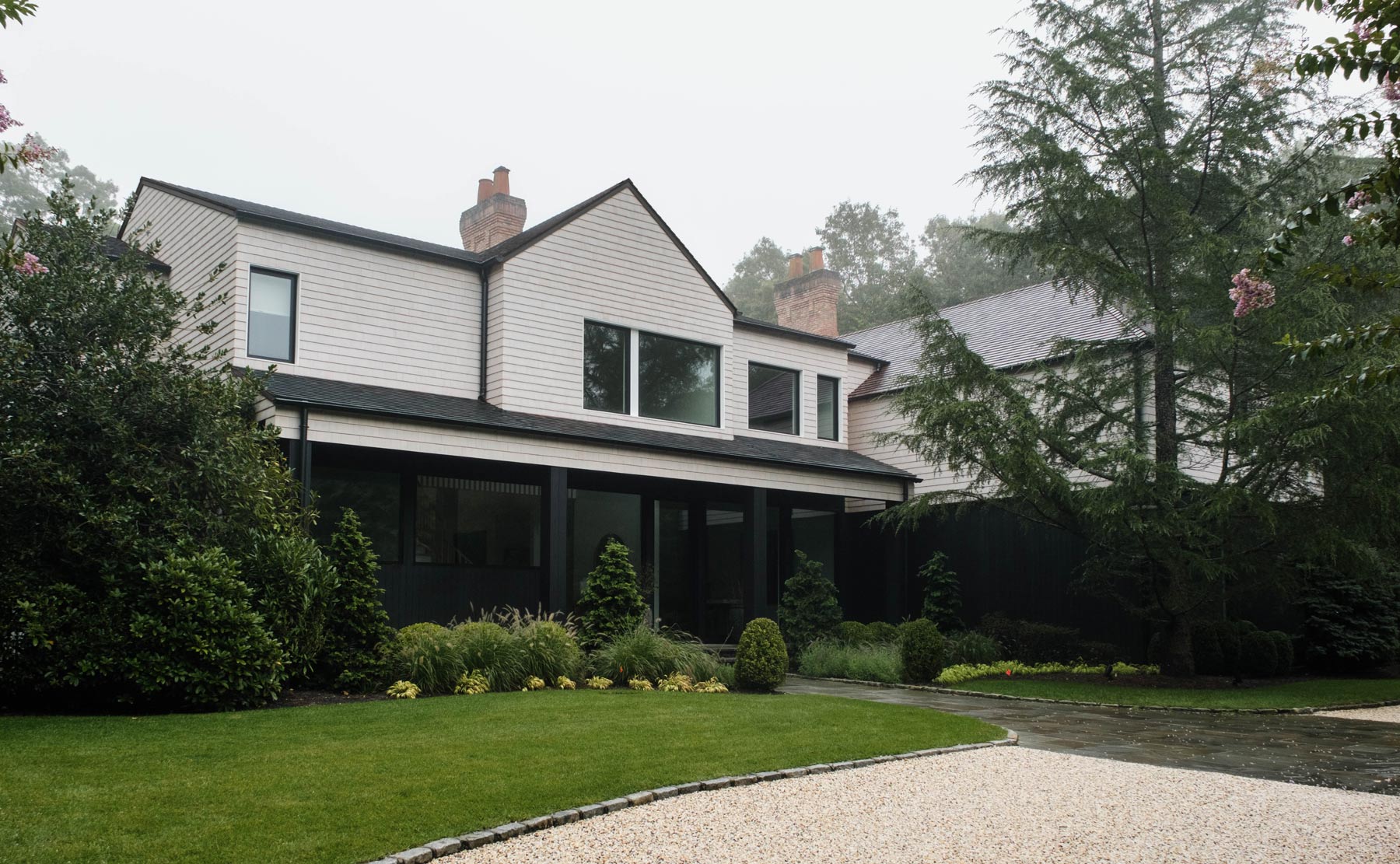
On the exterior, we faced the challenge of working with the existing structure while completely changing its personality. We moved away from "additive architecture"—the swooping roofs and unnecessary adornments that cluttered the original design. Instead, we brought the front facade down to its core massing. We then "reskinned" the home using a two-toned strategy: a heavy, dark material datum on the first floor to ground the building, and a lighter skin that wraps the second floor and roof to create a singular, continuous form.
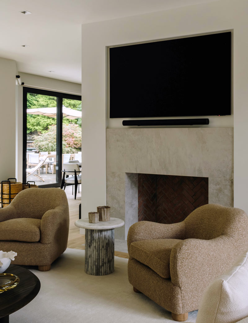
The stripping-away continued in the social spaces of the home as we removed thick, heavy trim and wall paneling that had previously made the rooms feel closed off. By replacing these elements with clean lines and floor-to-ceiling glazing, we created bright open seating areas that are fully interconnected.
Paired with the stunning interior design of Nina Takesh, these first-floor gathering spaces now flow effortlessly into the dining and entertaining zones, ensuring that the family feels connected to one another and to the landscape outside.
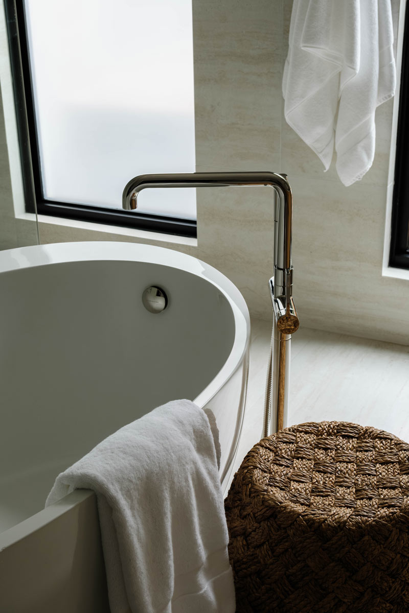
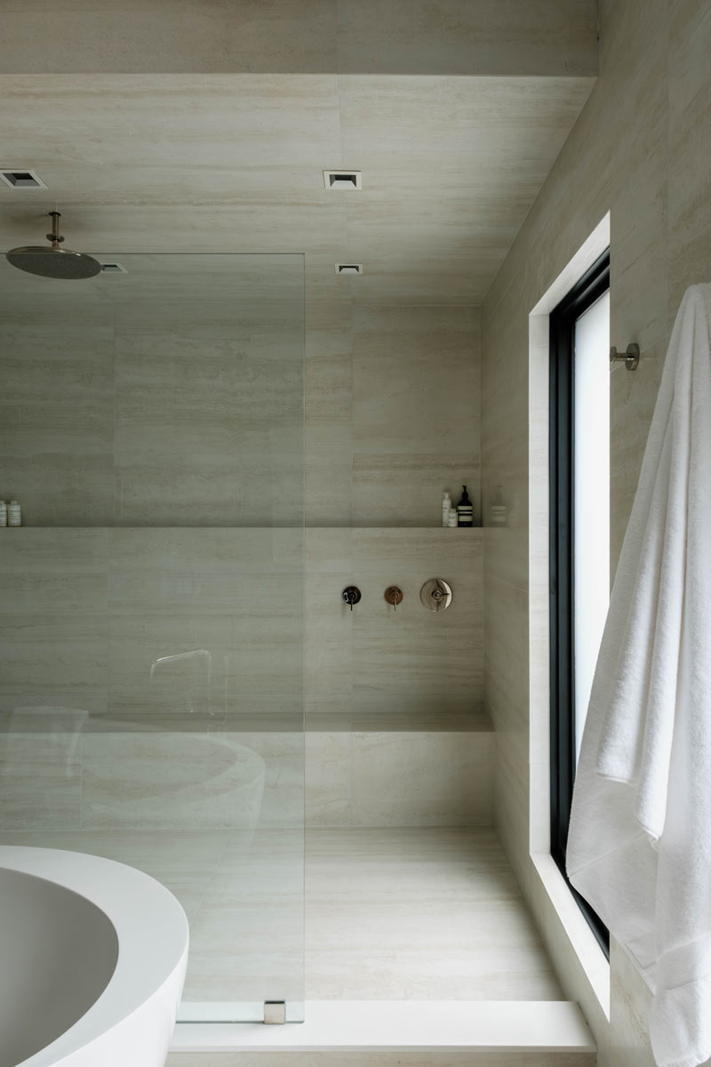
The primary suite was entirely gutted and reconfigured to address a lack of proportion in the original design. We capped the suite with a peaceful bathroom that feels intentional and zen-like. We even added larger windows to ensure these private zones are flooded with the same natural light that defines the rest of the home.
Ultimately, this Watermill Residence is about creating a place re-designed for this family’s lives. From the new first-floor gym and spa that keeps the family connected to the outdoors while they work out, to the rear yard featuring a large pool and stepped patio, every inch of the property was reconsidered. By removing the "noise" of the original architecture, we’ve created a home that brings joy through its simplicity, light, and renewed sense of purpose.